Dingers Athletics
DINGERS ATHLETICS offers competitive team baseball for ages 8-18 and an 11,000 sqft indoor training facility with batting cages and pitching lanes.
When Erin and Dingers hired us, they had a logo and a variety of mixed graphics they’d used over the years. They knew it was time to level up and fully build out their brand, website and social presence.
I served as the Creative Director on this project, so not only did I design the brand and extensions, I guided, oversaw and contributed to the development of the brand voice, website design and production, as well as the social media design.
Services:
Logo Modifications
Brand Extension Design,
Brand Voice
UX/UI
Custom Website Design
Social Media Design
Creative Direction
Agency:
Creative Director, Sawyer Media Group
Building the brand
Hitting a homerun…is there a better occurrence in baseball? A “dinger” is another term for homerun and the origin of their spunky name. Dingers really only had a logo, so they hired us to expand the brand package. The business owner pieced together the original logo herself, so although it wasn’t in the scope, we couldn’t expand this brand properly until we made some serious modifications to the wordmark.
Logo updates
To the untrained eye, the changes look minor, but for those design nerds out there, here are the subtle changes we made to the existing logo.
The colors
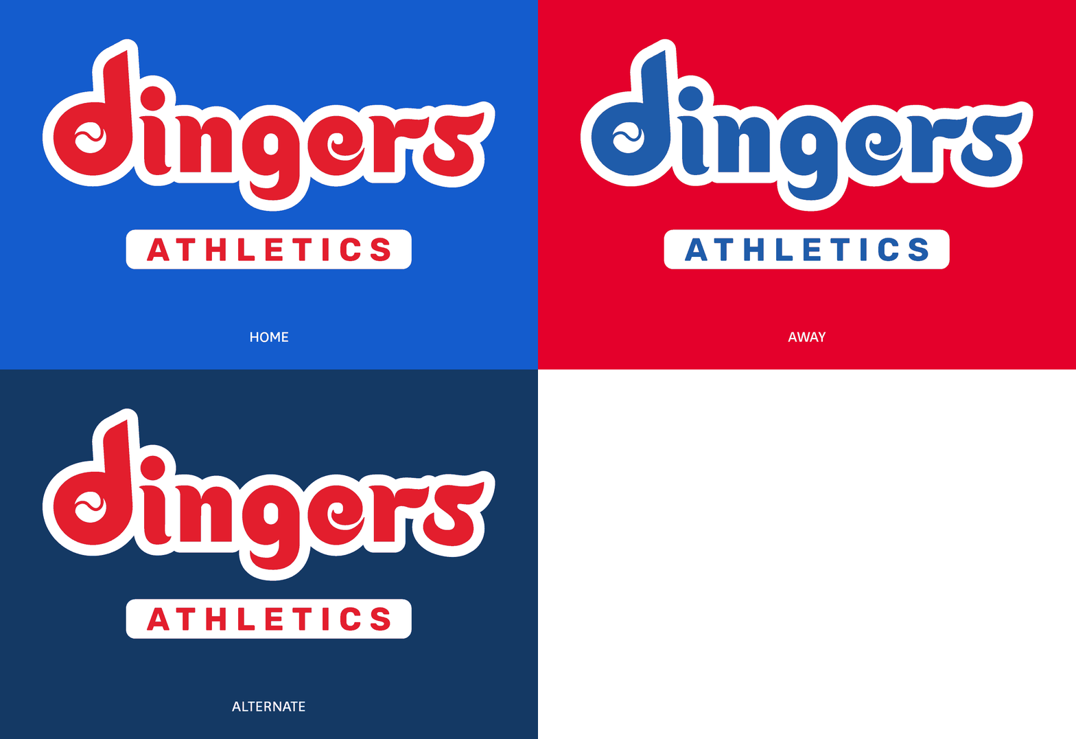
Dingers already had their primary red and blue palette and, in addition to expanding it, we defined the color protocol for their home, away and alternate jerseys.
Photography styling
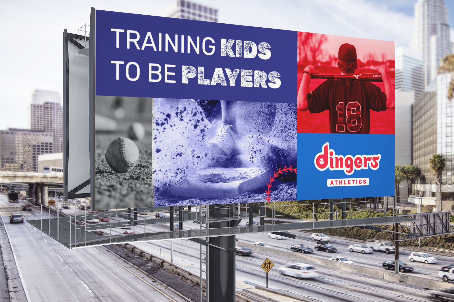
We used our photography styling to create a flexible grid system that would be easy for the client to replicate across marketing materials, utilizing a combination of individual players, teams and close up shots of baseball related images. To soften the many image style, we limited the palette to black and white with blue and red color overlays. To give a little more texture, we have an additional layer of graphic overlays.
The Website: Welcome to the big league
Dingers is not just a batting cage facility, it’s an elite baseball organization producing college athletes. The audiences for these two aspects of the organization are essentially the same, but they have very different missions when visiting the site. It was essential for parents to know that Dingers produces high quality players, as well as be able to easily fill out forms for sign up, working with trainers, or renting space in the facility.
We completely overhauled the UX/UA of the site to create a smoother experience and added custom design elements to elevate the look and feel.
Conveying Eliteness: Trading Card Animation
To show the parents of future players the quality of the program at Dingers, we designed this interaction to show our players that went on to play in college.
Fun Interaction: Team stats
Although Dingers is a serious organization, it’s for kids, so it still needs to be fun. To show team season stats we mimicked a scoreboard to add an amusing interactive break from the content.
Button design
Menu animation design
Managing a Team: Creative Direction
For this project, I served mostly as the Creative Director, guiding a Junior Designer in the creation of the majority of the site.
Ease of Use: Mobile Friendly Design
Our audience is comprised of busy parents on the go, so seamless mobile design was essential to a successful website. In particular, we needed our 8 different information forms to be extremely easy to use.
Bringing the brand to life on social
After building out a beautiful brand and website, the client asked us to help them implement it on their Instagram channel. Working with a Junior Designer, we created a variety of templates to aid in consistent posting.


