georgia organics
GEORGIA ORGANICS is a member-supported, non-profit organization that champions organic agriculture and healthy families by prioritizing farmer prosperity, engaging children with good food in their cafeterias and classrooms, and convening local leaders to address food access issues by making organic and local food accessible to all.
They came to us to design the brand identity for their annual Farm to School campaign, as well as a few other marketing materials along the way.
Services:
Brand Identity
Campaign Materials Design
Illustration
Agency:
Freelance, Gooneybird Design
Oh My Squash!
Each year, Georgia Organics coordinates a state-wide campaign to get kids across Georgia eating, growing, and learning about a new fruit or vegetable during October Farm to School Month.
In this year, the theme was Oh My Squash and the client wanted to explore a suite of characters expressing different emotions for the identity design. They were looking for a more illustrative brand, than a traditional one.
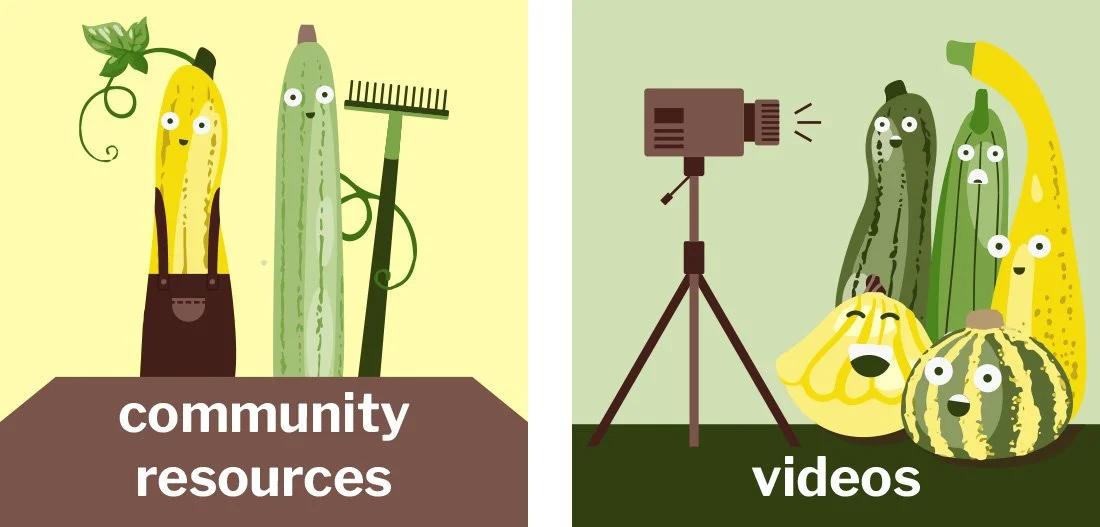
Materials buttons
The campaign is all about the resources they’re providing for educators and students. These buttons were designed for the website, so users would know where to access the information.
Sign up graphic
This graphic lives on the website and draws in users to sign up for the program.
Factsheets
The actual resources available to educators as part of the campaign.
Window cling
For schools to put in the windows to promote the Farm to School campaigns.
Kickin’ it with Kale
In this year of October Farm to School month, the campaign theme was around Kale. Here are the materials we put together.
Materials buttons
Sign up graphic
Factsheets


